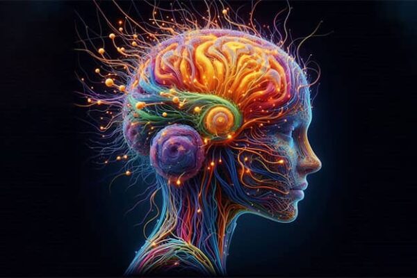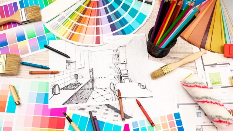
Color psychology in design is the scientific study of how colors affect human perception, emotions and behavior, and their application in various fields of design. Designers use the psychology of color to create harmonious and effective designs, taking into account the perception and emotional impact of color on the audience.
Understanding color psychology helps designers select color schemes and combinations that are appropriate for a specific project, target audience, and cultural context.
Applying color psychology to design can improve work efficiency, improve user experience, increase conversions and sales, and create the right mood and atmosphere in various design fields such as graphic design, web design, interior and architecture, product design, and others.
Color psychology in design plays a very important role indeed, since colors evoke different emotions and associations in people. By using colors consciously, designers are able to create impressions and highlight certain elements.
Here are a few key design aspects where color psychology matters:
- Influence on emotions. Colors can evoke different emotions in people. For example, red is associated with energy, passion and activity, while blue can evoke feelings of calm and security.
- Creating an atmosphere. Choosing the right colors helps create the desired atmosphere in your interior or website. For example, light colors give a feeling of spaciousness, while dark colors make the space feel cozy.
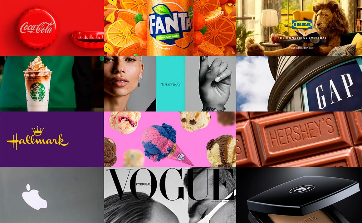
- Branding. Colors are important branding tools, they help differentiate a product or service in the market and create brand awareness.
- Improved functionality. Colors can be used to enhance the functionality of products, websites or interiors. For example, contrasting shades make information easier to perceive, and color accents direct attention to important elements.
- Cultural differences. Colors have different meanings and associations in different cultures. Therefore, designers need to take into account the cultural background of the audience to avoid misunderstandings and negative associations.
Given the importance of color psychology in design, designers must carefully consider the color palette of their work to effectively convey desired messages and create a positive impression on users or consumers.
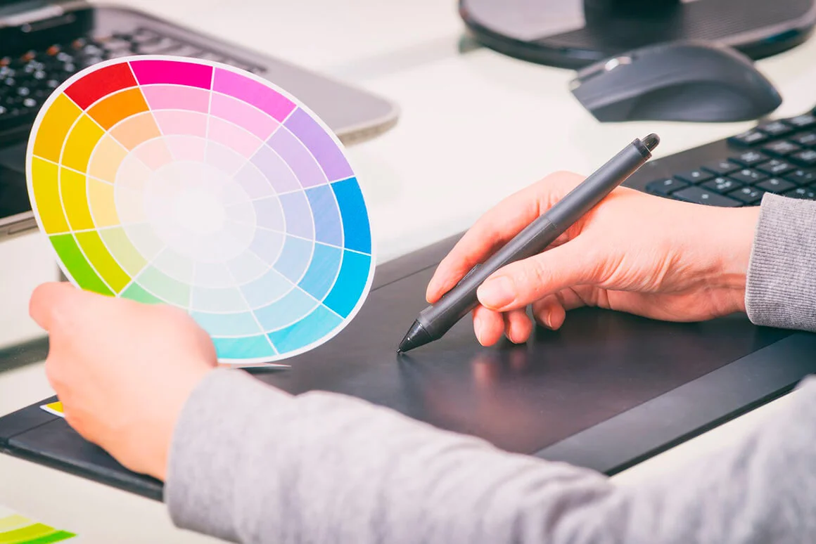
Color theory
Color theory is the scientific and practical study of color, its perception and effect on humans. Color theory combines aspects of physics, chemistry, physiology, psychology, and design to create a systematic approach to the analysis and use of colors. Here are some basic concepts and principles associated with this theory:
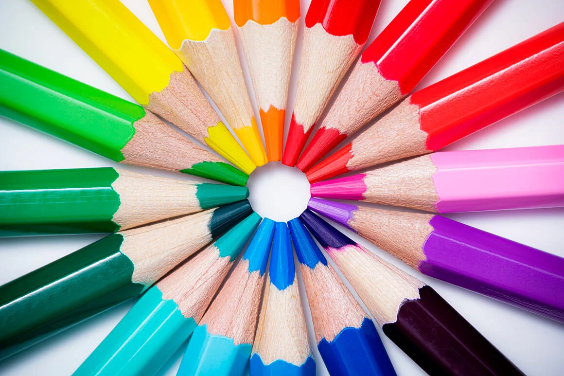
- The color wheel is a model that represents the colors of the visible spectrum in a circular manner. It is used to understand the relationships between colors and determine color harmonies. The color wheel usually includes 12 primary colors, divided into primary, secondary and tertiary.
- Color schemes are combinations of colors based on certain principles such as analogous, complementary, triadic and tetradic colors. These schemes are used to create harmonious and aesthetically pleasing color combinations in a design.
- Color harmony describes a combination of colors that work well together and create a pleasing feel. The definition of color harmony depends on cultural, historical and individual preferences.
- Color models are systems for representing color in numerical or algebraic form. There are many color models, including RGB (red, green, blue), CMYK (cyan, magenta, yellow, black), and HSL (hue, saturation, lightness), that are used for a variety of purposes in computer graphics, printing, and design.
- Color perception is the process by which the eyes and brain perceive and interpret color. It depends on the lighting conditions, the characteristics of the observer (such as age and vision) and the environmental context. Color perception is subjective and subject to individual differences, including cultural and emotional associations.
- Color contrast is the difference in brightness, saturation, or hue between two or more colors. Contrast is used to create visual hierarchy, emphasize important elements, and make text or images easier to read.
- Color associations are the psychological and cultural connections that people make with certain colors. Associations may include emotions, atmosphere, or meanings that are conveyed through the use of color. Considering color associations is important when creating a design to evoke the desired reaction in the audience.
- Color psychology studies the effects of color on human behavior, emotions and thinking. It is used to optimize design for perception, brain impact and mood. Color psychology helps designers choose colors that will motivate, calm, or stimulate their audience.
- Color temperature describes the characteristics of a color based on the warmth or coolness of its hue. Warm colors such as red, orange and yellow are typically associated with energy and activity, while cool colors such as blue and green are often associated with calm and stability.
- Color accessibility is used in design to provide better perception and interaction for users with different needs, including people with visual impairments or color disorders. This may include text contrast, alternative color schemes, and the use of accessibility standards to ensure the design is usable and versatile.
- Color balance refers to the combination and distribution of colors in a design in such a way as to create a visually pleasing and balanced image. This may include distributing colors evenly, using patterns and contrasts, and managing the perception of weight and space through color.
- Color and design trends reflect social and cultural changes that influence the choice and use of color in various fields such as graphic design, interiors, fashion and product design. Studying trends helps designers create relevant and attractive designs that reflect modern preferences and tastes.
Overall, color theory provides the tools and knowledge to create color schemes that provide aesthetic appeal, functionality, and psychological relevance. Using the principles and concepts of color theory allows designers and artists to make informed choices and create visual materials that successfully engage with audiences and achieve communication goals.
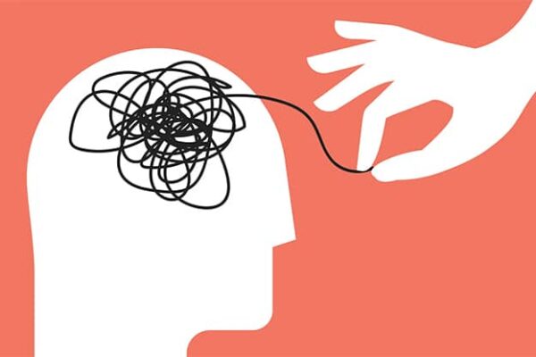
Human color perception
Human color perception is the process by which the eye and brain perceive and interpret electromagnetic waves of different wavelengths, called colors. Colors are the result of light interacting with photoreceptors in the retina and then processing the information in the brain.
Color perception depends on several factors:
- Lighting. The intensity and quality of light influence how we perceive colors. Under different lighting conditions, the same object may appear different colors.
- Physiology. Photoreceptors on the retina called cones are responsible for color vision. Humans have three types of cones, each of which is sensitive to specific wavelengths – red, green and blue light. It is their combination that allows us to see many colors. However, people with color vision defects (color blindness) may have distorted color perception.
- Context. Colors may appear different depending on the hues and background surrounding them. This phenomenon is known as color adaptation or contrast.
- Culture and learning. Color perception can also be influenced by cultural and personal factors. Different cultures attach different meanings and associations to certain colors.
- Psychology and emotions. Certain colors evoke different emotions and associations in people. For example, the color red may be associated with danger or passion, while blue may evoke feelings of calm and security.
Color perception is a complex and multifactorial process that depends on physical, biological, cultural and psychological factors.
Understanding this process helps designers effectively use color to create harmonious and visually appealing compositions that take into account the emotional impact, cultural associations and specific needs of the target audience.
This is especially important when working on projects where color is a key element of communication and impact, such as advertising, branding, web design and interior design.
Color psychology in design: emotional and psychological impact of color
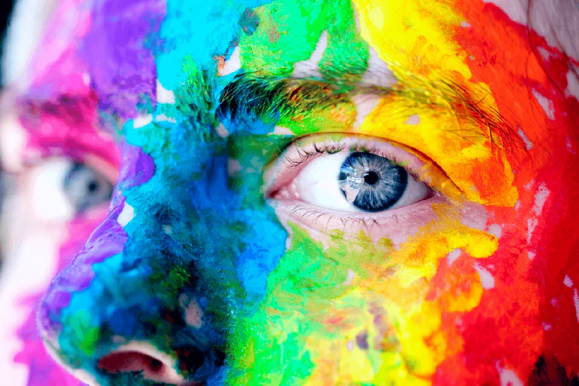
The emotional and psychological impact of color plays a significant role in our lives. Colors can have a powerful impact on our feelings, emotions, mood and even behavior. They stimulate or calm us, make us happy or sad, confident or uncertain. It is important to understand that different colors can evoke different reactions in different people, as each person has their own individual preferences and associations.
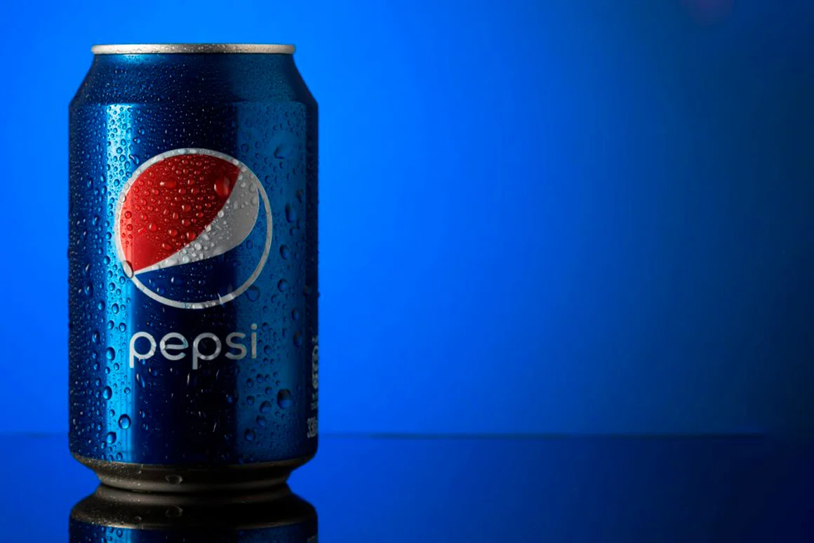
There are several general trends regarding the emotional and psychological effects of certain colors. For example, the color red is often associated with danger, passion, strength and energy. It has the ability to evoke a sense of mindfulness and energize us. Blue, on the other hand, is usually associated with calmness, stability and reliability. This color helps you concentrate and gives you a feeling of security. Green is generally associated with nature, freshness and harmony, which induces a feeling of calm and relaxation.
However, the emotional and psychological impact of color can vary depending on cultural context and individual experience. In different cultures, the same shades have completely different meanings and associations. For example, in Western countries the color white is often associated with purity and innocence, while in some Eastern cultures it is a symbol of sorrow and death.
Designers must consider the emotional and psychological impact of color when creating their work. The correct choice of color palette improves the perception of the project and enhances its impact on the audience. Careful planning and use of color based on its psychological impact improves design effectiveness, enhances communication, and evokes the right emotions in users and clients.
The use of color in design should also be tailored to the specific industry, goals, and context of the project. For example, in advertising and marketing, the choice of shades can directly influence the perception of a brand, product or service, and even purchasing behavior. In the interior, the right combination of colors helps create a certain atmosphere, improve the comfort and mood of visitors or residents. In web design, colors reinforce visual hierarchy, direct users’ attention to key elements, and improve the overall user experience.
In addition, designers must be flexible and take into account the individual differences in color perception among different people. This is especially important in terms of accessibility and design versatility. For example, considering the needs of people with limited color vision or color blindness, designers can use contrast, textures, and patterns to ensure better information perception and accessibility for all users.
Choosing a color palette taking into account the psychological preferences of the target audience
Choosing a color palette taking into account the psychological preferences of the target audience includes the following steps:
Target audience analysis
To determine the color palette that will be most attractive to your target audience, you need to conduct research and determine its key demographic and psychographic characteristics. This may include age, gender, education, interests, hobbies, worldview and other factors.
Determining psychological associations of colors
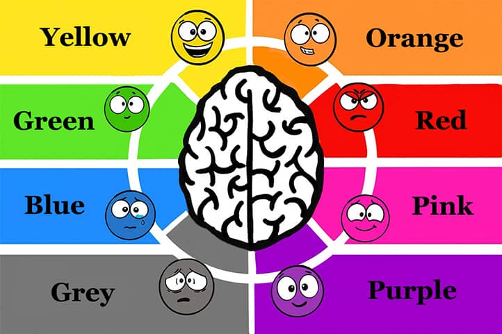
Each color has its own psychological associations that can evoke certain emotions or perceptions in your target audience. It is important to consider these associations when choosing a color palette. Below are the main colors and their psychological associations:
- Red: passion, activity, aggression, danger, warmth.
- Blue: calm, trust, reliability, intelligence, stability.
- Green: nature, tranquility, growth, freshness, fertility.
- Yellow: happiness, optimism, warmth, energy, attention.
- Orange: energy, warmth, joy, comfort, enthusiasm.
- Purple: creativity, luxury, wisdom, spirituality, sacredness.
- Black: strength, elegance, formality, mystery, solidity.
- White: purity, innocence, simplicity, light, impeccability.
- Gray: moderation, stability, practicality, restraint, professionalism.
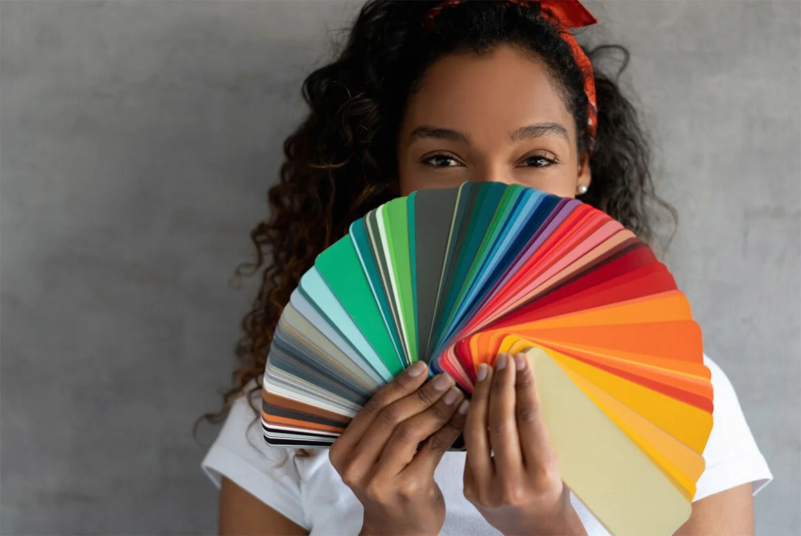
Creating a Color Palette
Based on the analysis of the target audience and the psychological associations of colors, choose the colors that best suit your audience and the goals of the project. When creating a color palette, you can use different schemes and color combinations (monochromatic, analogous, contrasting, etc.) to create a harmonious and attractive image.
Applying a color palette
Apply your chosen color palette to all aspects of your project to create a unified and consistent style. This could include website design, social media, promotional materials, product packaging, etc. Make sure the colors you choose work well together and support the psychological associations you want to evoke in your target audience.
Testing and adaptation
After implementing the color palette, conduct testing and collect feedback from the target audience. This may include analysis of user behavior on the site, surveys, focus groups, etc. If the test results show that the selected palette does not achieve the desired effect or causes undesirable reactions, it will need to be adapted.
Monitoring and updating
Color trends and audience preferences can change over time, so it’s important to regularly monitor audience reactions and be prepared to update your color palette if necessary. Also keep an eye on general design trends and color psychology research to stay up to date on current approaches and best practices.
So, choosing a color palette based on psychological preferences is an important aspect of developing an effective and attractive design. It helps to create a harmonious image that reflects the goals of the project and takes into account the preferences of the target audience.
Creating psychologically harmonious color combinations
Creating psychologically harmonious color combinations involves choosing colors that are consistent and have the desired psychological effect on the target audience. Let’s look at basic color schemes and their psychological effects, as well as examples of successful psychological combinations.
Basic color schemes and their psychological effects
- Monochromatic scheme consists of one primary color and its shades. This scheme creates a feeling of calm, unity and harmony, but can be perceived as boring and monotonous unless contrasting accents are added.
- Similar scheme uses colors that are next to each other on the color wheel. Similar colors usually have similar psychological associations, which can create a harmonious and balanced impression.
- Complementary Scheme combines colors that are opposite each other on the color wheel. These colors usually contrast with each other, creating a dynamic and vibrant impression. However, using colors that are too contrasting can cause tension and discomfort.
- Triadic Scheme uses three colors evenly spaced on the color wheel. Such a scheme can create a striking and at the same time balanced impression. It is important to correctly distribute accents and balance the intensity of colors.
Examples of successful psychological combinations
- Blue and Green: The combination of these two colors creates an atmosphere of calm and freshness, which can be an ideal choice for decorating office spaces or healthcare facilities.
- Yellow and orange: These colors evoke warmth, sunshine and optimism, making them suitable for children’s products or travel services.
- Purple and Gold: The color combination of purple and gold creates an atmosphere of luxury, creativity and nobility. This combination is ideal for high-quality products, beauty and fashion services, as well as art and design.
- Red and Black: this combination evokes strength, passion and elegance. It is often used in the design of cars, sporting goods and in advertising of strong and dynamic brands.
- White and Gray: The neutral combination of white and gray creates a clean, simple, and professional feel. This combination can be used in the interiors of modern offices, technical and scientific companies, as well as in medical institutions.
- Green and brown: This combination creates an atmosphere of nature, earth and ecology. It is suitable for organizations related to environmental protection, agriculture, as well as for interior design in eco or country style.
- Pink and Grey: The combination of soft pink and neutral gray creates an atmosphere of coziness, softness and femininity. This combination is suitable for children’s products, textiles, cosmetics, as well as for decorating the interiors of cafes and pastry shops.
- Navy and Gold: The color combination of navy blue and gold evokes luxury, elegance and prestige. Great for jewelry, hospitality, banking and financial services.
- Turquoise and Coral: The bright and cheerful combination of turquoise and coral creates an atmosphere of energy, warmth and positivity. This combination can be used in the design of clothing, accessories, travel services and events.
- Light green and Beige: the combination of light green and beige creates an atmosphere of tenderness, freshness and natural harmony. Great for residential interiors, spas, health and wellness products.
- Lavender and Mint: The combination of lavender and mint colors creates an atmosphere of calm, relaxation and tranquility. This combination can be used to decorate the interiors of spas, meditation centers and in textile design.
- Terracotta and Sand: the combination of terracotta and sand colors creates an atmosphere of earthly harmony, comfort and stability. Great for decorating interiors in rustic and country styles, as well as for styling garden spaces and landscape design.
It is important to consider that each target audience has its own preferences and associations with certain colors. Therefore, when creating psychologically harmonious color combinations, you should take into account not only general psychological aspects, but also the specifics of your project and target audience. Experiment with different color schemes and analyze user feedback to find the most suitable and successful combinations.
Color psychology in design across different cultures
Considering the psychological context across cultures is essential when creating designs that will be positively received and work effectively with diverse audiences. Let’s look at the differences in color psychology between cultures and approaches to creating cross-cultural design with universal color solutions.
Differences in psychological perception of color
Colors can evoke different associations and emotions depending on the cultural context. For example:
- Red in Western countries is often associated with love, passion and danger, while in China it symbolizes happiness, good luck and festive mood.
- White in Western countries is associated with purity, innocence and peace, but in some Eastern cultures, such as India, it symbolizes sorrow and death.
- Green. While green is associated with nature, growth and ecology in many cultures, in some countries such as Indonesia it may have religious significance associated with Islam.
Multicultural design and versatile color options
When creating multicultural design, it is important to take into account differences in the psychological perception of color and strive for universal color solutions. Below are some approaches that can help with this:
- Cultural research: explore the cultural context of your target audience to better understand their preferences and associations with certain colors. This will help create a design that will be perceived positively and perform effectively.
- Using universal colors: some colors, such as blue, gray and green, have similar psychological associations across many cultures. Blue, for example, is often associated with trust, stability and professionalism, making it a good choice for many cross-cultural projects.
- Simple and neutral color schemes: using simple and neutral color schemes, such as black and white or gray and white combinations, can provide design versatility and reduce the likelihood of negative associations with certain colors.
- Design flexibility and customization: allowing design to be adapted and customized across cultures and regions can help accommodate differences in psychological perceptions of color. For example, creating versions of your design with different color accents for different regions can help accommodate cultural preferences and avoid negative associations.
- Feedback from the target audience: collect feedback from your target audience to better understand the preferences, associations and emotional perception of the design. This will help adapt the design to different cultures and make it more versatile and effective.
- Collaboration with international designers and experts: working with designers and experts from different cultures will enrich your understanding of the psychological perception of color and help you create designs that are successful internationally.
Using Color to Manage Attention and Emotions
Using color to manage attention and emotions plays an important role in design. Colors help to emphasize important elements and also influence the emotional state of the user or viewer. Let’s look at two main approaches to using color in this context.
Accentuating important elements using color
To draw attention to certain design elements, you can use colors that stand out against the background. For example:
- Bright, bold colors like red, orange, or yellow attract attention and highlight important elements (buttons, links, or alerts).
- Contrasting colors and color combinations help highlight text, images, or other elements from the background. For example, black text on a white background or white text on a dark background.
Working with contrasts and color saturation
Contrast and color saturation also influence the perception and emotions of users or viewers. Some approaches to working with contrasts and color saturation include:
- Harmonious color combinations: using colors that harmoniously combine with each other creates a pleasant aesthetic impression and promotes emotional comfort. Examples of harmonious combinations include analogous (close on the color wheel) and complementary (opposite on the color wheel) shades.
- Moderation in the use of bright colors: Although bright and saturated colors attract attention, their excessive use can create a feeling of chaos or irritation. Moderate use of bright colors will help balance the design and control the user’s emotional state.
- Shades and midtone colors soften the impression of the design and make it more peaceful and calm. They also help create depth and complexity in the design and provide a wider range of emotional responses.
- Color hierarchy: using color to create hierarchy in a design helps the user or viewer more easily navigate and understand the importance of different elements. For example, brighter, more saturated colors are best used to highlight key elements or information, while less saturated or neutral colors can be used for secondary or background elements.
- Emotional context: taking into account the emotional context and target audience allows you to choose colors that evoke the desired emotions and associations. For example, using warm colors such as red, orange or yellow can help create a feeling of energy, activity and optimism, while cool colors such as blue, green or purple can evoke feelings of calm, stability and professionalism.
- Color adaptability: given the variety of devices, screens, and lighting conditions, it’s important to ensure color responsiveness. This may include using colors with good visibility and contrast on different types of screens, as well as providing alternative color schemes for users with special needs such as color blindness.
Overall, using color to manipulate attention and emotion is an important aspect of design. The correct selection of colors, contrasts and saturation can significantly improve the user experience, facilitate navigation and interaction with the design, and also evoke the desired emotions and associations among the target audience.
The influence of color psychology in design on conversion and sales
The influence of color psychology on conversion and sales plays a significant role in marketing and design. The correct use of colors can influence the decision making and motivation of potential customers. Let’s consider two main aspects of this influence.
Psychological effect of color on decision making
Colors can evoke different associations, emotions and impressions in potential customers, which in turn influences their willingness to purchase or interact with a brand. For example:
- Trust and Professionalism: The use of blue and green is often associated with trust, stability and professionalism, which can increase the likelihood of purchasing or doing business with a company.
- Stimulation and activation: Bright and warm colors such as red, orange and yellow stimulate activity and increase energy, which can encourage customers to take action, such as clicking a buy or subscribe button.
Design optimization for maximum conversion taking into account psychological factors
To achieve maximum conversion and sales, the design must be optimized taking into account the psychological aspects of color perception. Some design optimization approaches include:
- Accentuate important elements: using contrasting and bright colors to highlight key elements, such as the “Buy”, “Subscribe” or “Contact Us” buttons, will help attract the customer’s attention and increase the likelihood of conversion.
- Branding consistency: matching the color palette of the design with the main colors of the brand promotes recognition and trust in the company. It also creates a sense of consistency and professionalism, which can influence the perception of the product or service.
- Testing and analysis: conducting A/B testing and analysis of different color schemes will help determine which colors and combinations are most effective in increasing conversions and sales. This will allow you to make informed decisions about choosing a color palette and designing your website or promotional materials.
- Considering cultural and demographic characteristics: Understanding the target audience and their cultural preferences will allow you to choose colors that are most likely to evoke positive associations and emotions in potential customers. This may include studying the color preferences of different age groups, genders, cultures or geographic regions.
- Consider color associations across industries: depending on the industry and type of product or service, certain colors may be more appropriate and effective in increasing conversions and sales. For example, green is often associated with ecology and health, so it is suitable for brands associated with organic products or a healthy lifestyle.
- Accessibility and usability: considering the needs of users with disabilities, such as color blindness or low vision, helps make design more accessible and increase its effectiveness. This may include using high contrast colors and developing alternative color schemes for users with special needs.
Using these approaches, you can optimize your design for color psychology, maximize conversions, and increase sales. Effective use of color creates a powerful psychological effect that motivates potential customers to interact with the brand and purchase products or services.
Application of color psychology in different areas of design
The application of color psychology plays an important role in various areas of design. Let’s look at how it can be used in graphic design, web design, interior and architecture, and product design.
Graphic design and the psychological impact of color
In graphic design, colors are used to convey information, emphasize key elements, and create emotional impact. This may include:
- Creating a unified style and branding for a company or product.
- Manages attention and directs the user’s focus to important elements such as logos, headlines or images.
- Creating a certain atmosphere or mood that matches the goals and character of the product or company.
Web design and considering the psychology of color perception
In web design, choosing the right colors can improve the user experience and promote successful conversions. Some aspects of applying color psychology to web design include:
- Create intuitive navigation and hierarchy using color to indicate the importance of different elements.
- Ensuring accessibility and usability for users with disabilities or special needs.
- Adaptation of the color palette for different devices, screens and lighting conditions.
Colors in interior and architecture from a psychological point of view
In interior design and architecture, colors can be used to create a certain feeling and atmosphere, as well as to control a space. Possible approaches to applying color psychology in this area:
- Selecting colors that promote comfort, calm or energy, depending on the function and purpose of the room.
- Creating visual accents and zoning space using contrasting colors or rich shades.
- Taking into account cultural and regional characteristics when choosing color solutions for interiors and architectural objects.
Product design and the influence of color on consumer preferences
In product design, colors are used to create an attractive appearance and meet the needs of different target audiences. Applications of color psychology in product design may include:
- Selecting colors that match the character and functionality of the product, and also evoke the desired associations among consumers.
- Taking into account the demographic and cultural characteristics of the target audience when choosing color solutions for the product.
- Creating innovative and unique color combinations that will help the product stand out in the market and attract the attention of potential buyers.
Overall, understanding and using the psychology of color in various areas of design can help create effective and attractive solutions that meet the needs and expectations of users, as well as improve interactions with products or services.